

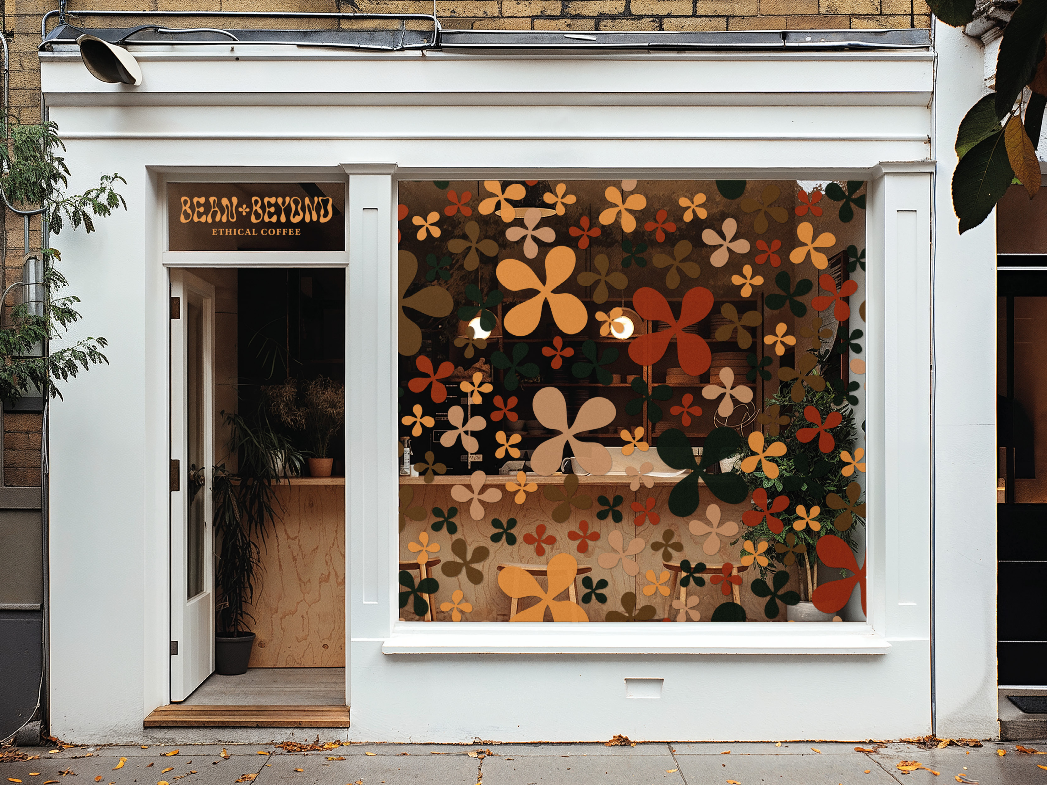

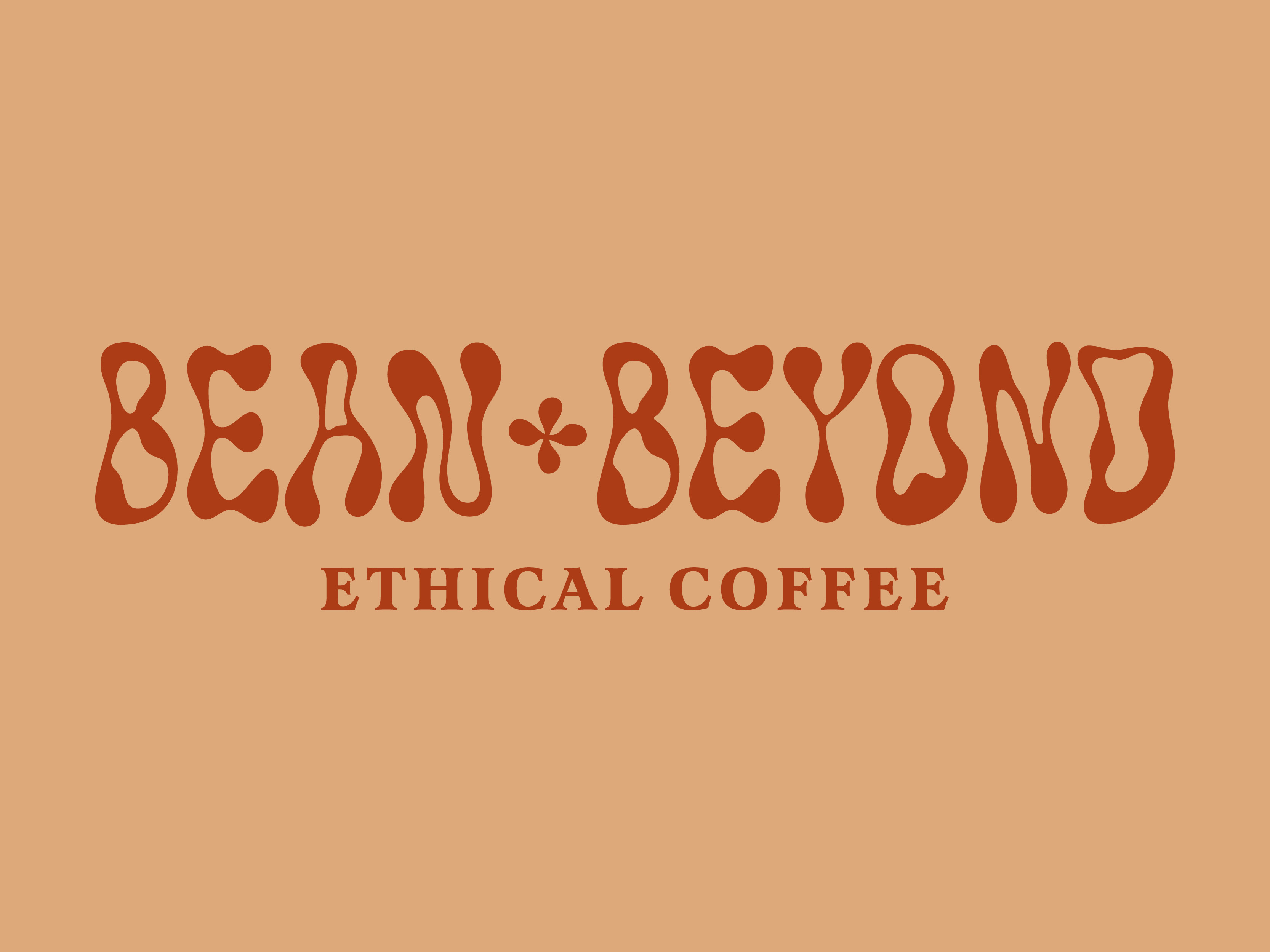
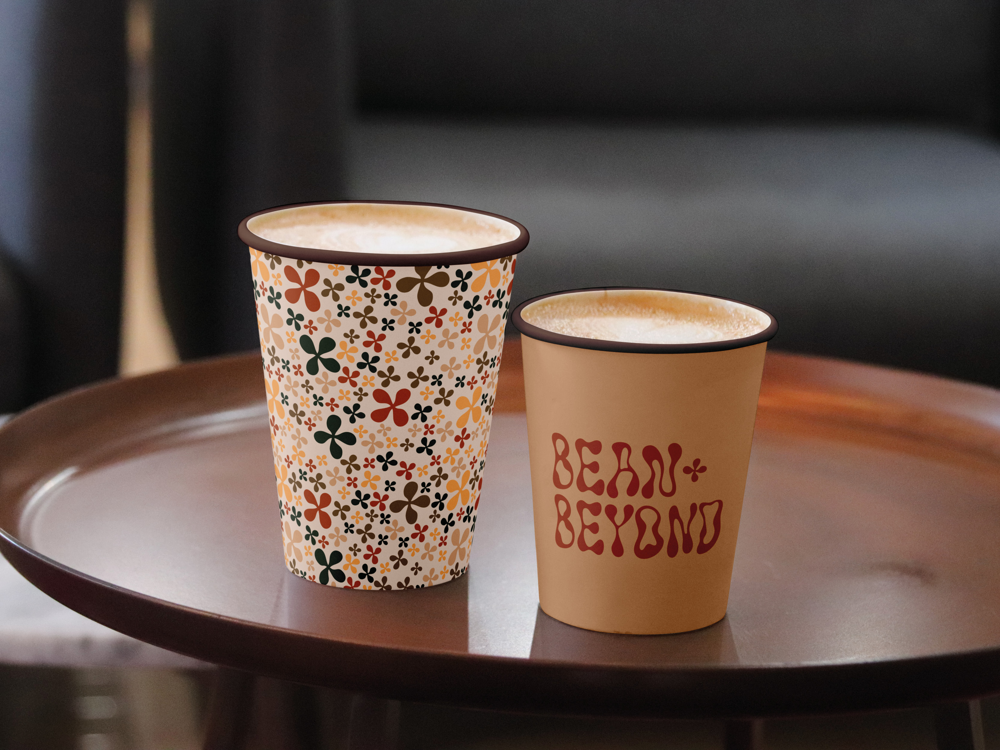
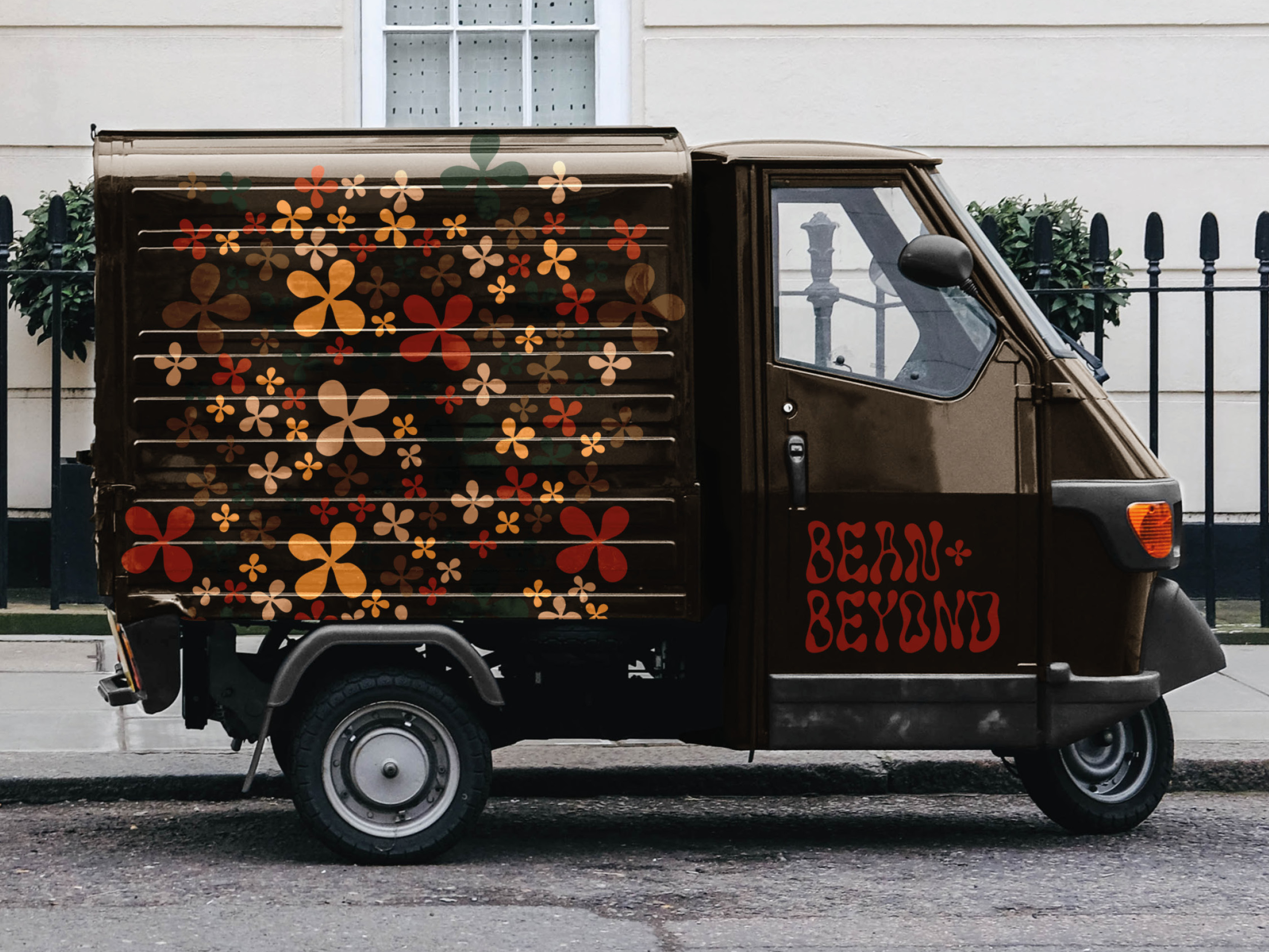
Client was keen to reflect the sustainable USP in the brand launch. The logo uses a customised Solvent typeface with tight kerning, allowing for a handcrafted aesthetic reminiscent of the rebellious mindset of the 60s. Latienne typeface is used for secondary text, being legible at all sizes, serifs giving a timeless application.
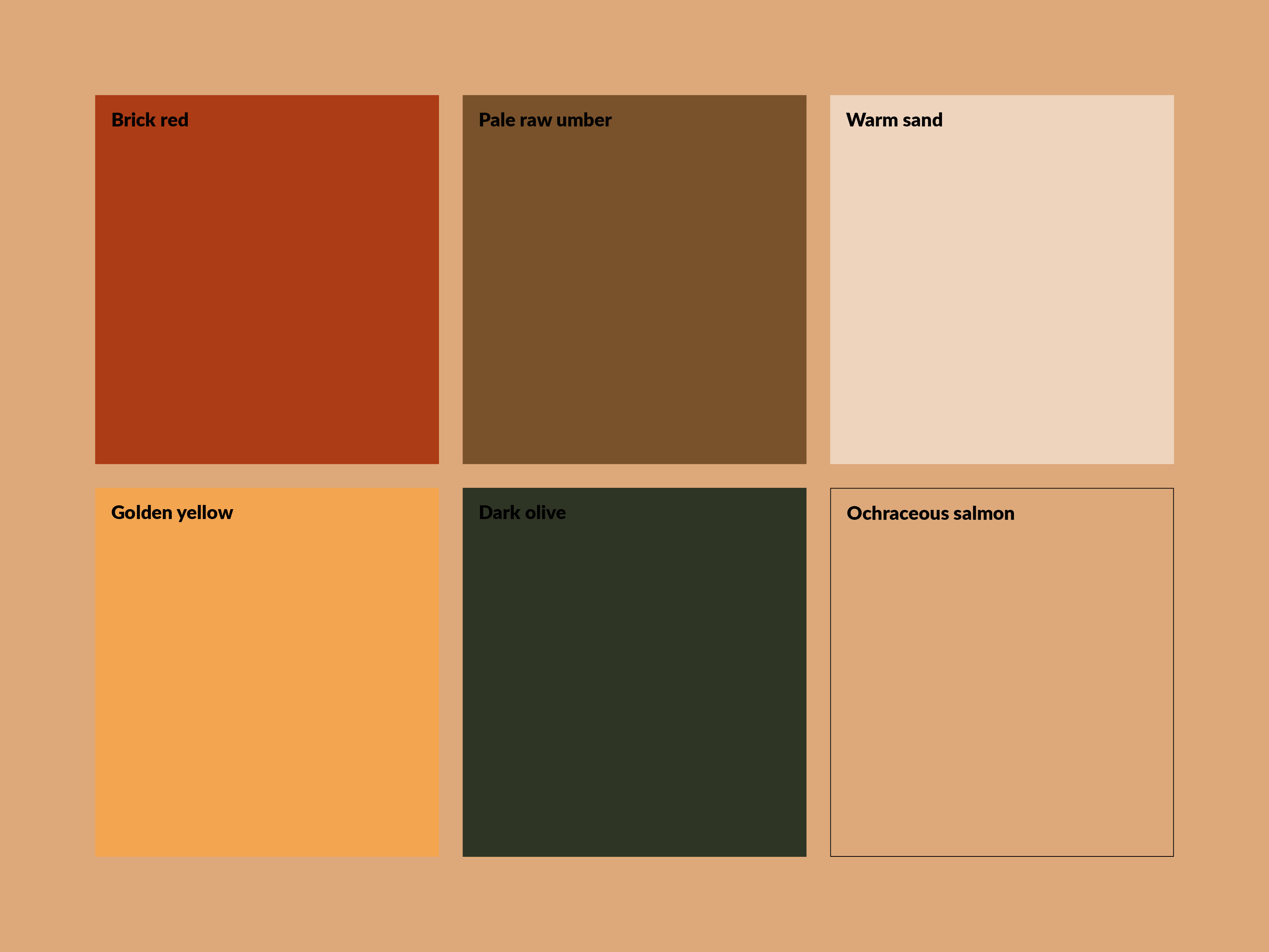
Colours are neutral and organic, with a broad colour scheme that works hormoniously across physical touchpoints.
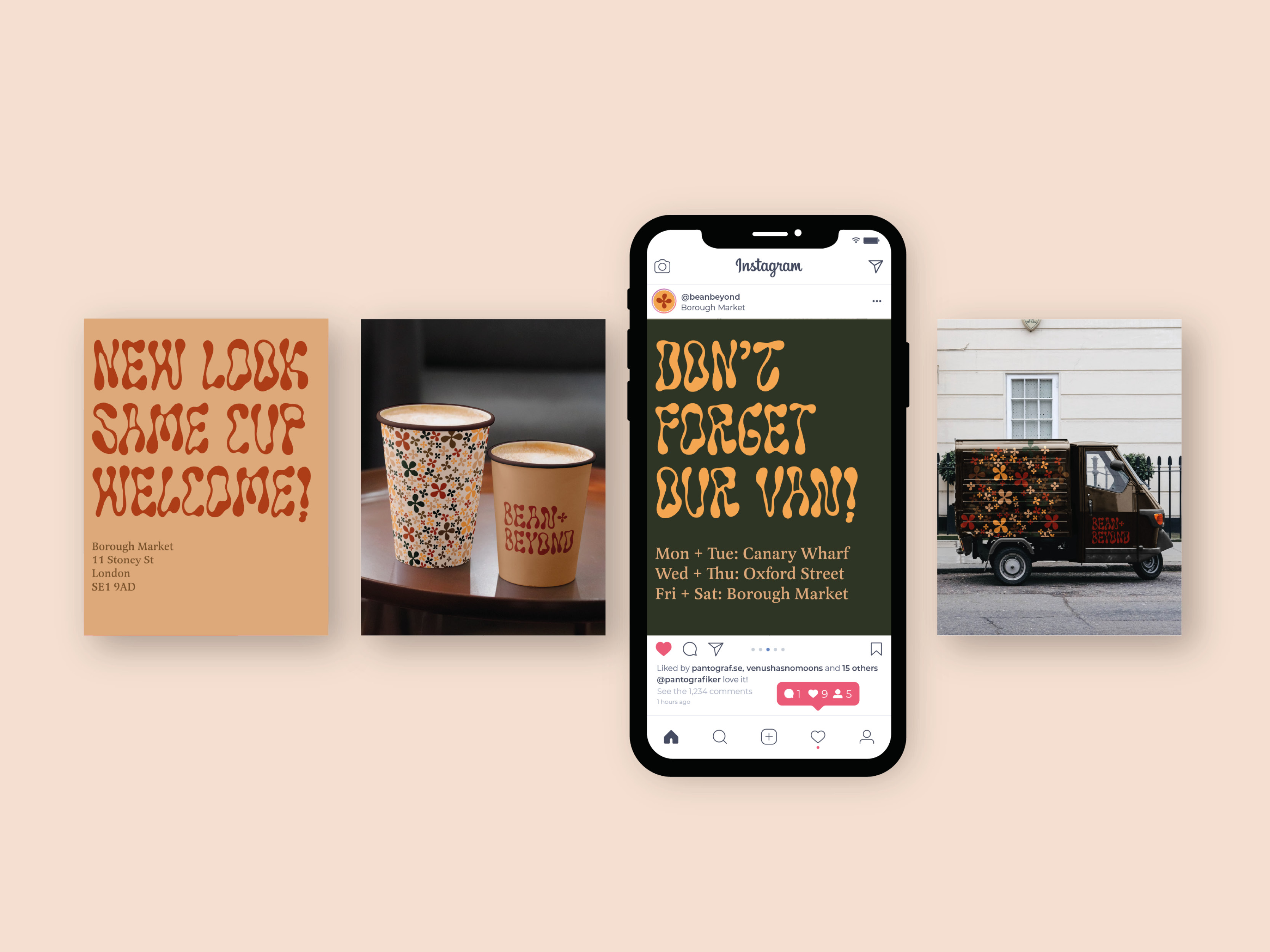
The '+' is lifted from the logo for use as a recognisable icon, as well as forming a pattern that is used across packaging, signage, and promotion.
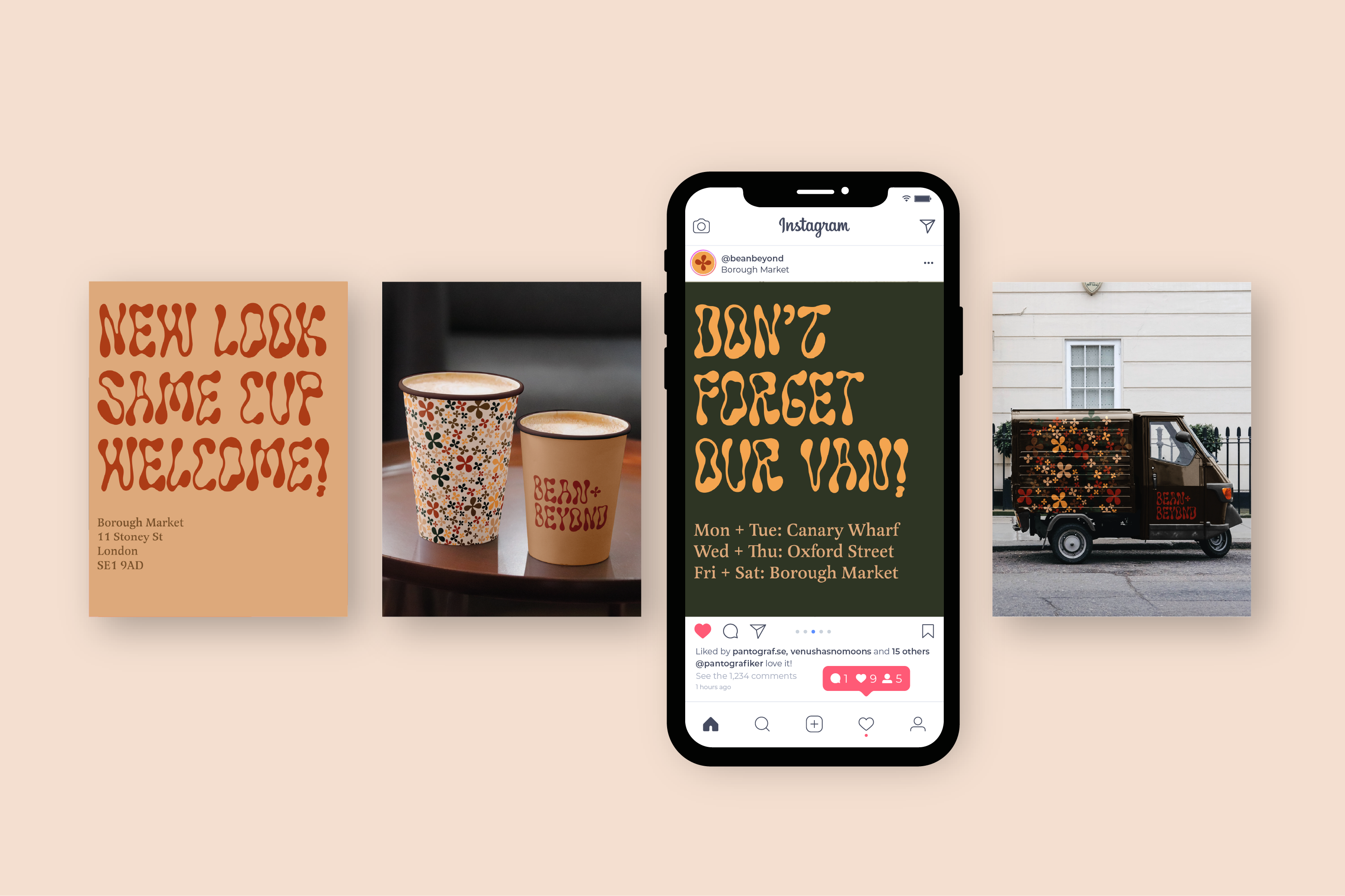
Social media strategy uses the typeface boldly and extensively for tailored messaging.


